Concurrency in system architecture represents the simultaneous execution of multiple processes. It is a fundamental concept in distributed systems, operating systems, and high-performance computing. When components interact, timing and synchronization become critical. Misaligned interactions can lead to race conditions, deadlocks, or data inconsistency. To visualize these complex interactions, engineers rely on specific modeling techniques. Among them, the Timing Diagram stands out for its ability to depict time-dependent behavior precisely. This guide explores a comprehensive case study on modeling concurrency using this method. We will dissect the structure, analyze a realistic scenario, and highlight best practices for accurate representation.
Understanding the Timing Diagram 📐
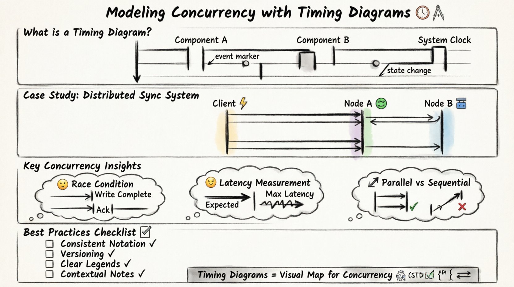
A timing diagram is a specific type of Unified Modeling Language (UML) diagram. It focuses on the timing relationships between objects or processes. Unlike sequence diagrams, which emphasize the order of messages, timing diagrams emphasize the state of objects over time. The vertical axis represents time, flowing downwards. The horizontal axis represents different objects, processes, or system components.
Key characteristics include:
- Time Scale: A continuous line indicating the passage of time.
- State Lifelines: Vertical rectangles showing when an object is active or inactive.
- Event Markers: Small circles or notches on the lifeline indicating specific events.
- State Changes: Transitions between active and inactive states.
When modeling concurrency, these elements allow us to see exactly when resources are locked, when data is read, and when responses are sent. This visual precision is vital for debugging performance bottlenecks.
The Case Study Scenario 🧩
To demonstrate the utility of timing diagrams, consider a distributed data synchronization system. This system involves three main components:
- Client Application: The source initiating a write request.
- Middleware Layer: Handles load balancing and request routing.
- Database Cluster: Two nodes (Node A and Node B) storing the data.
The goal is to ensure data consistency across both nodes while maintaining low latency. The concurrency challenge arises because multiple clients may send write requests simultaneously, and the middleware must decide how to distribute these tasks.
Initial Requirements 📋
Before drawing the diagram, we must define the constraints:
- Read operations must always be served from the most recent write.
- Write operations must be acknowledged only after replication is complete.
- The system must handle network latency variability.
- Deadlocks must be prevented during lock acquisition.
These requirements dictate the timing constraints we will model. For instance, if a write takes longer than expected on Node A, the system must not block the Client Application indefinitely.
Modeling the Interaction Step-by-Step 🛠️
Constructing the timing diagram requires a structured approach. We break the process down into logical phases. Each phase adds a layer of detail to the visualization.
Step 1: Define the Actors and Lifelines 🏷️
Start by drawing vertical lines for each component. Label them clearly:
- Client ⚡
- Middleware 🔄
- Node A 🟢
- Node B 🔵
Ensure the horizontal spacing reflects the logical grouping. The Database Cluster nodes should be grouped together visually, even if they are separate lines.
Step 2: Establish Time Zero ⏱️
Define the starting point. This is typically the moment the Client Application sends the first request. Mark this point clearly at the top of the lifeline. All subsequent events are measured relative to this timestamp.
Step 3: Map Active States 🟦
Draw rectangles along the lifelines to indicate active periods. An active state means the component is processing a task. For example:
- The Client is active while waiting for a response.
- The Middleware is active while routing the request.
- The Nodes are active while writing to the disk.
These bars help visualize the duration of tasks. If a bar is significantly longer than others, it indicates a potential bottleneck.
Step 4: Insert Events and Messages ➡️
Connect the lifelines with arrows to represent messages. In a timing diagram, these arrows are often horizontal or diagonal. Label them with the action, such as “Request Write” or “Acknowledge”.
Crucially, annotate the time taken for each message. If the network latency is known, add a value like “50ms”. If it is variable, note “Variable”.
Analyzing Concurrency Patterns 🔄
Once the initial model is drawn, we analyze the concurrency patterns. This is where the timing diagram proves its value. We look for specific patterns that indicate health or risk.
Parallel Execution vs. Sequential Blocking
One of the primary benefits of this modeling technique is distinguishing between parallel and sequential execution. In our case study, the Middleware could send the write request to Node A and Node B simultaneously. This is parallel execution.
Alternatively, it could send to Node A, wait for completion, and then send to Node B. This is sequential. The timing diagram makes this distinction obvious.
Parallel Pattern:
- Client sends to Middleware.
- Middleware sends to Node A and Node B at the same time.
- Both nodes process independently.
- Middleware waits for both before replying.
Sequential Pattern:
- Client sends to Middleware.
- Middleware sends to Node A.
- Middleware waits for Node A.
- Middleware sends to Node B.
- Middleware waits for Node B.
The timing diagram will show two parallel bars for the parallel pattern and one stacked bar for the sequential pattern. This visual cue helps architects choose the right strategy.
Identifying Race Conditions ⚠️
A race condition occurs when the system outcome depends on the relative timing of events. In our synchronization scenario, a race condition might happen if Node A writes the data but Node B fails, yet the Client receives an acknowledgment.
On the timing diagram, this appears as a mismatch. The “Acknowledge” message from the Middleware might occur before the “Write Complete” event on Node B. By visualizing the timeline, engineers can spot these gaps.
Measuring Latency and Jitter 📉
Real-world systems face network jitter. The timing diagram allows us to model worst-case scenarios. We can draw a “Max Latency” line alongside the “Expected Latency” line.
By comparing the two, we can determine if the system meets its Service Level Agreements (SLAs). If the Max Latency bar extends beyond the Client timeout threshold, the design requires optimization.
Common Pitfalls in Timing Models 🚧
While powerful, timing diagrams can be misleading if not constructed correctly. Several common pitfalls exist that engineers must avoid.
Pitfall 1: Ignoring Asynchronous Behavior
Not all messages are synchronous. Some systems use fire-and-forget patterns. If you model an asynchronous event as a blocking wait, the diagram will show unnecessary delays. Clearly label messages as “Sync” or “Async”.
Pitfall 2: Overlooking Background Tasks
Systems often run background processes like logging or caching. These do not block the main request but consume resources. If these are not represented, the diagram will underestimate the load on the nodes.
Pitfall 3: Vague Time Granularity
Using inconsistent time scales can distort the perception of concurrency. If one event is measured in milliseconds and another in seconds without clear labels, the diagram becomes unreadable. Stick to a consistent unit or provide a clear scale bar.
Pitfall 4: Missing Resource Contention
Concurrency often involves shared resources like database locks. If the diagram does not show when a lock is acquired and released, it is impossible to see if two processes are fighting for the same resource. Add specific markers for lock acquisition.
Advanced Analysis Techniques 🔍
Beyond basic visualization, timing diagrams support deeper analysis. Here are advanced techniques to extract value from the model.
Scenario Simulation
Modify the diagram to simulate different failure modes. What happens if Node B is slow? Extend the “Write” bar for Node B. Observe how this affects the Client timeout. This helps in designing fallback mechanisms.
Critical Path Identification
Identify the longest path from start to finish. This is the critical path. Any delay here delays the entire transaction. Focus optimization efforts on the components on this path.
Resource Utilization Correlation
Combine the timing diagram with resource usage data. If a lifeline shows high activity, correlate it with CPU or Memory spikes. This helps in capacity planning.
Best Practices for Documentation 📝
To ensure the timing diagram remains useful over time, follow these documentation guidelines.
- Consistent Notation: Use the same symbols for active states and events across all diagrams in the project.
- Versioning: Update the diagram whenever the concurrency logic changes. Treat it as code documentation.
- Clear Legends: Include a legend explaining all symbols, especially custom markers for locks or errors.
- Contextual Notes: Add text boxes to explain complex logic that cannot be shown graphically.
Comparing Concurrency Strategies 📊
To further clarify the utility of timing diagrams, compare different concurrency strategies using a table. This helps in decision-making during the design phase.
| Strategy | Timing Diagram Appearance | Pros | Cons |
|---|---|---|---|
| Pipeline | Overlapping bars on sequential lifelines | High throughput | Complex state management |
| Fork-Join | Broad horizontal spread then merge | Simplifies parallel work | Join latency can be high |
| Queue-Based | Wait times shown as gaps | Decouples components | Added latency from queuing |
| Lock-Step | Synchronized start and end points | Predictable timing | Low flexibility |
By mapping these patterns onto a timing diagram, the trade-offs become visually apparent. The visual representation often reveals issues that text descriptions miss.
Integrating with System Design 🏗️
Timing diagrams should not exist in isolation. They must integrate with other system design artifacts.
- State Diagrams: Use timing diagrams to validate state transitions over time.
- Architecture Diagrams: Ensure the lifelines in the timing diagram match the components in the architecture.
- API Contracts: Ensure the message labels match the API definitions.
This integration ensures consistency. If the timing diagram shows a response time of 100ms, but the API contract allows for 500ms, there is a discrepancy to resolve.
Refining the Model Through Iteration 🔄
Modeling is rarely a one-time task. It is an iterative process. As the system evolves, the timing diagram must evolve with it.
Iteration 1: High-Level Flow
Start with major components and general timeframes. Identify the gross structure of the interaction.
Iteration 2: Detailed Timing
Add specific durations and latency estimates. Refine the active state bars to be more accurate.
Iteration 3: Edge Cases
Model failure scenarios. What does the diagram look like when a node is unreachable? This prepares the team for error handling.
Iteration 4: Optimization
After implementing changes, update the diagram to reflect the new reality. Compare the old and new diagrams to measure improvement.
Conclusion on Modeling Efficacy ✅
Modeling concurrency with timing diagrams provides a rigorous framework for understanding system behavior. It moves beyond abstract concepts and grounds the design in measurable time. By visualizing the interplay of events, teams can identify bottlenecks, prevent race conditions, and optimize resource usage.
The process requires discipline and attention to detail. However, the payoff is a system that is more predictable and robust. Whether designing a simple microservice or a complex distributed database, the timing diagram remains an essential tool. It bridges the gap between logical flow and temporal reality.
When documenting concurrency, prioritize clarity. Use consistent symbols, accurate labels, and realistic time estimates. Treat the diagram as a living document that evolves with the code. In doing so, you ensure that the system design remains aligned with the operational requirements throughout its lifecycle.
Remember that concurrency is not just about speed; it is about order and synchronization. The timing diagram is the map that guides you through the complexity. Use it wisely to navigate the challenges of modern system architecture.