In the landscape of system design and business analysis, information often gets lost in translation. 🗣️ Technical teams speak in logic and database schemas, while business stakeholders speak in goals, revenue, and user experience. This disconnect can lead to missed requirements, scope creep, and products that do not meet the intended needs. A Data Flow Diagram (DFD) serves as a universal visual language that bridges this gap. It allows complex systems to be broken down into understandable components, fostering clarity and alignment across the organization.
This guide explores how to utilize DFDs effectively. We will move beyond simple technical documentation and focus on the strategic value of these diagrams. By visualizing data movement, teams can identify bottlenecks, validate business rules, and ensure everyone is looking at the same picture. 🎯
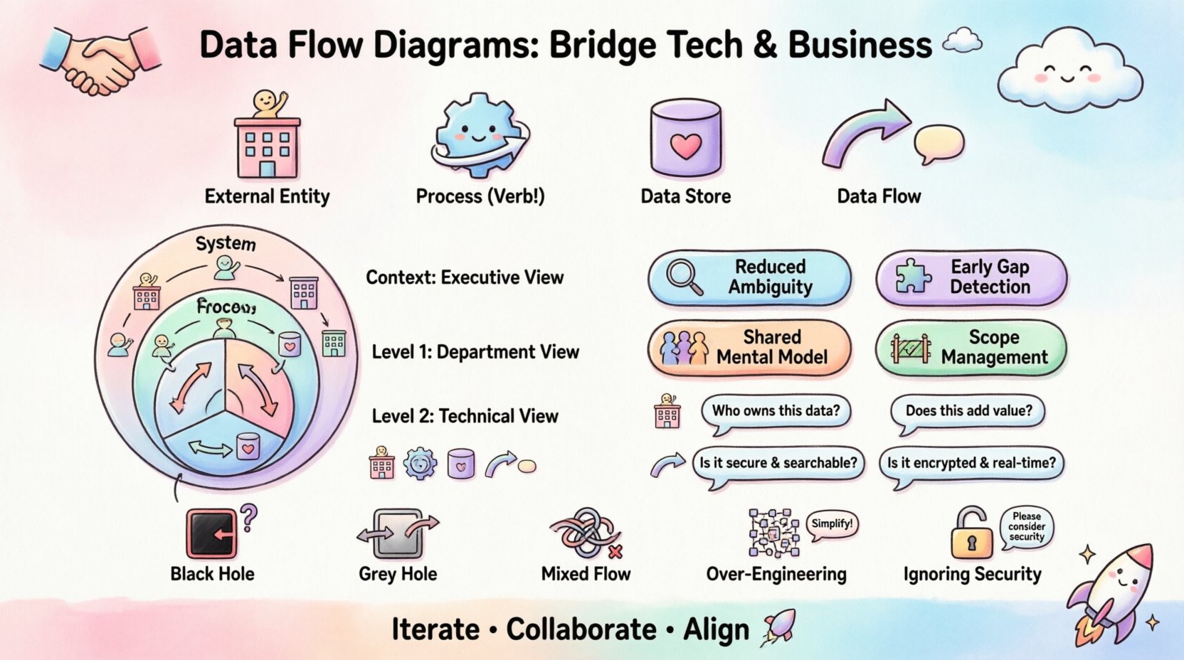
🧩 Understanding the Core Components of a DFD
Before diving into communication strategies, it is essential to understand the building blocks. A DFD is a graphical representation of the flow of data through a system. It does not describe the physical hardware or the specific technology stack. Instead, it focuses on the logical flow. This abstraction is what makes it valuable for stakeholders who may not understand code but understand business processes.
There are four primary elements found in every standard diagram:
- External Entities: These represent sources or destinations of data outside the system boundary. They are the people, departments, or other systems that interact with the process. Examples include a Customer, a Banking System, or a Warehouse Manager. 🏢
- Processes: These are the actions that transform data. They take input data and convert it into output data. A process must be verb-oriented, such as Calculate Tax or Validate User. 🔄
- Data Stores: These represent where data is saved for future use. They are not the physical servers but the logical repositories. Think of them as Order History or Customer Profiles. 🗄️
- Data Flows: These are the arrows showing the movement of data. They connect entities, processes, and stores. Every flow must have a meaningful name, such as Payment Details or Shipping Address. ➡️
When presenting these components to a non-technical audience, the focus should be on the what and the why, not the how. Stakeholders need to see where information enters, how it changes, and where it ends up.
👁️ The Strategic Value of Visualization
Textual requirements documents are dense and prone to ambiguity. A paragraph describing a login sequence can be interpreted in multiple ways. A diagram, however, provides a singular point of truth. Here is why visualization is critical for alignment:
- Reduced Ambiguity: Visuals remove the guesswork. If an arrow points from a Process to a Store, the stakeholder understands that data is being saved. If it points to an Entity, they understand data is leaving the system. 📉
- Early Detection of Gaps: When stakeholders review a diagram, they often spot missing steps immediately. “Wait, does the refund process update the inventory store?” This question is easier to ask when looking at a flow than reading a list of functional requirements. ❓
- Shared Mental Model: A DFD creates a shared reference point. During meetings, team members can point to a specific box and say, “This is where the issue lies.” This reduces arguments and focuses the conversation on solutions. 🤝
- Scope Management: It becomes easier to see what is inside the system boundary and what is outside. This helps prevent scope creep by clearly defining the system’s responsibilities. 🚧
📈 Levels of Abstraction in DFDs
Not all diagrams are created equal. To communicate effectively, you must choose the right level of detail. Overwhelming a stakeholder with every single database field is counterproductive. Conversely, showing nothing is unhelpful. The standard approach involves a hierarchy of diagrams.
1. Context Diagram (Level 0)
This is the highest-level view. It shows the system as a single bubble and all external entities interacting with it. It answers the question: What is the system, and who talks to it?
- Best for: High-level executive summaries.
- Focus: Boundaries and major inputs/outputs.
- Complexity: Low.
2. Level 1 Diagram
This breaks the single bubble of the Context Diagram into major sub-processes. It shows the main functional areas of the system. For example, an E-commerce system might break down into Order Management, Inventory Control, and Customer Service.
- Best for: Department heads and functional managers.
- Focus: Major workflow stages.
- Complexity: Medium.
3. Level 2 Diagrams
These drill down into specific sub-processes from Level 1. They show the detailed logic within a specific area. This level is often too detailed for general stakeholders but is crucial for developers and analysts.
- Best for: Technical teams and process owners.
- Focus: Detailed logic and decision points.
- Complexity: High.
📋 Mapping DFD Components to Business Value
To help stakeholders understand the utility of a DFD, it helps to map technical elements directly to business value. Use the following table to frame your discussion during meetings.
| DFD Component | Technical Definition | Business Value / Question to Ask |
|---|---|---|
| External Entity | Source or Destination | Who owns this data? Do we have permission to access it? |
| Process | Action / Transformation | Does this step add value? Is it compliant with regulations? |
| Data Store | Repository | How long do we keep this? Is it secure? Is it searchable? |
| Data Flow | Information Transfer | Is this data sensitive? Does it need encryption? Is it real-time? |
This mapping shifts the conversation from “What does the arrow mean?” to “What does this flow mean for our business?”.
🤝 Facilitating Stakeholder Workshops
Creating the diagram is only half the battle. The real alignment happens during the review sessions. How you conduct these workshops determines the success of the communication.
Preparation Phase
- Know Your Audience: If presenting to the CFO, focus on financial data flows and compliance. If presenting to the Marketing Director, focus on customer data and campaign triggers.
- Keep it Clean: Avoid clutter. If a diagram has too many boxes, break it into a series of smaller diagrams. Cognitive load is real; do not overwhelm the viewer. 🧠
- Label Everything: Every arrow and box must have a clear label. An unlabeled flow is a source of confusion.
During the Session
- Walk Through the Flow: Start at an external entity and follow the data until it disappears or is stored. Narrate the story. “A customer places an order here, which triggers the inventory check…”
- Encourage Questioning: Ask specific questions. “If the payment fails, where does the data go?” rather than “Does this make sense?”
- Document Decisions: If a stakeholder suggests a change, record it immediately. Do not rely on memory. Use a change log attached to the diagram.
Post-Session Follow-up
- Distribute the Final Version: Send the approved diagram to all participants. Ensure the version control is clear.
- Archive the History: Keep older versions. They provide a record of how requirements evolved over time.
⚠️ Common Pitfalls in DFD Creation
Even with the best intentions, diagrams can become confusing. Avoid these common traps to maintain clarity and authority.
1. The “Black Hole”
A black hole occurs when a process has inputs but no outputs. This indicates missing logic. In a stakeholder meeting, this is a red flag. It implies data disappears without a trace, which usually violates business rules. 🔍
2. The “Grey Hole”
A grey hole happens when the inputs do not match the outputs. For example, a process receives a full order but only outputs the shipping confirmation. Missing data suggests incomplete requirements.
3. Mixing Data with Control
DFDs track data, not control flow. Do not use arrows to show “if this happens, then do that.” That is a flowchart, not a data flow diagram. Mixing them confuses the purpose. Stick to data movement. 🚫
4. Over-Engineering
Do not diagram every single database field. Stakeholders care about the concept, not the schema. A flow labeled “Customer Address” is sufficient; it does not need to show “First Name,” “Last Name,” and “Zip Code” separately unless the logic differs for each.
5. Ignoring Security
When dealing with sensitive information, the diagram should indicate encryption or access controls. If a flow crosses a security boundary, mark it clearly. This ensures stakeholders understand the compliance implications. 🔒
🔄 Maintenance and Lifecycle
A diagram is not a one-time artifact. It is a living document that must evolve with the system. Systems change, and if the DFD does not change, it becomes misleading. Misleading diagrams destroy trust.
- Review Triggers: Establish rules for when a diagram must be updated. Triggers include major feature releases, infrastructure changes, or regulatory updates.
- Versioning: Use version numbers on the title block. Version 1.0 is different from Version 2.0. This prevents teams from working off outdated information.
- Accessibility: Store diagrams in a central repository where all stakeholders can access them. Do not email static images that get lost in threads. A shared knowledge base is best. 📂
By treating the DFD as a dynamic tool rather than a static report, you maintain its relevance. It becomes a reference point for onboarding new employees and auditing current processes.
🏁 Final Thoughts on Alignment
Building a system is a collaborative effort. The Data Flow Diagram is more than just a technical drawing; it is a communication tool that aligns vision with execution. When stakeholders understand the flow of information, they can make better decisions about resources, risks, and priorities.
Remember that the goal is not perfection in the first draft. The goal is understanding. Start simple, invite feedback, and refine the model iteratively. This approach builds confidence among the team and ensures the final product reflects the true needs of the business. 🚀
By adhering to these principles, you transform the DFD from a dry technical requirement into a strategic asset. It becomes the blueprint that guides the organization toward clarity and success.