In modern software architecture and system design, visualizing how components interact over time is critical. A timing diagram provides a precise snapshot of signal behavior, state transitions, and temporal constraints within a system. For software engineers, mastering these diagrams means understanding latency, concurrency, and the exact sequence of events that drive system reliability.
Unlike high-level flowcharts, timing diagrams focus on the when rather than just the what. They are essential for debugging race conditions, optimizing API response times, and ensuring hardware-software integration works as intended. This guide breaks down the mechanics, applications, and best practices for creating and reading timing diagrams effectively.
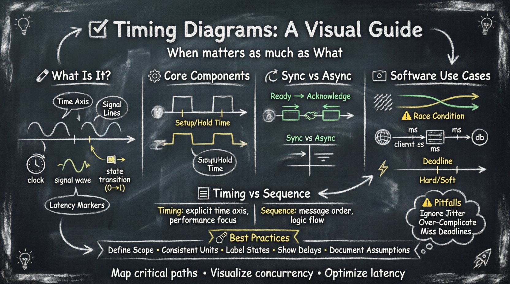
🔍 What Is a Timing Diagram?
A timing diagram is a graphical representation that shows how signals change over time. It plots time on the horizontal axis and signal states on the vertical axis. This visualization helps engineers analyze the timing relationships between different parts of a system, whether that involves hardware registers, network packets, or software threads.
Key characteristics include:
- Time Axis: Represents the progression of events, usually flowing left to right.
- Signal Lines: Vertical lines representing specific variables, wires, or data streams.
- State Changes: Horizontal transitions indicating a shift from 0 to 1, or from idle to active.
- Latency Markers: Indicators showing the delay between a request and a response.
For software engineers, these diagrams bridge the gap between abstract logic and physical execution time. They reveal bottlenecks that sequence diagrams often hide.
⚙️ Core Components of a Timing Diagram
Constructing a clear timing diagram requires attention to specific elements. Each component conveys vital information about system behavior.
1. Signals and States
Signals represent data or control lines. In software contexts, these might map to function calls, thread locks, or network packets. States define the current status of a signal:
- Active High: The signal is true, enabled, or sending data.
- Active Low: The signal is false, disabled, or waiting.
- High-Z (High Impedance): The signal is disconnected or floating.
- Unknown: The state is indeterminate.
2. Time Scales and Units
Accuracy depends on the scale. Microseconds matter for real-time systems, while milliseconds might suffice for web APIs. Consistency in units prevents misinterpretation.
- Fixed Scale: Uniform intervals across the entire diagram.
- Relative Scale: Focusing on the duration between specific events.
- Logarithmic Scale: Used when events span vastly different timeframes.
3. Events and Transitions
Events trigger state changes. A rising edge indicates a transition from low to high. A falling edge indicates high to low. In software, this corresponds to an interrupt firing, a lock being acquired, or a packet arriving.
⏱️ Synchronous vs. Asynchronous Communication
Timing diagrams are particularly useful for distinguishing between synchronous and asynchronous interactions. Understanding the difference is key to designing robust distributed systems.
Synchronous Timing
Synchronous systems rely on a shared clock signal. Events occur at specific intervals determined by this clock. This approach ensures that components operate in lockstep.
- Clock Signal: A regular pulse that dictates timing.
- Data Validity: Data must be stable before the clock edge triggers a change.
- Setup and Hold Times: Constraints defining how long before and after a clock edge data must remain stable.
In software, this resembles thread synchronization where operations must complete before the next cycle begins. It is predictable but can introduce idle time if one component is slower.
Asynchronous Timing
Asynchronous systems do not rely on a global clock. Communication is driven by requests and acknowledgments. This allows components to operate at different speeds.
- Handshake Protocols: Signals like “Ready” and “Acknowledge” manage flow.
- Variable Latency: Response times depend on system load.
- Event-Driven: Actions trigger only when conditions are met.
This model fits well with modern web services, where a server processes a request and returns a response without waiting for a global clock tick.
🖥️ Timing Diagrams in Software Engineering
While often associated with hardware, timing diagrams hold significant value in software development. They help visualize concurrency, network latency, and dependency chains.
1. Concurrency and Race Conditions
When multiple threads access shared resources, timing becomes critical. A diagram can illustrate overlapping execution windows.
- Thread A: Acquires lock at t1.
- Thread B: Waits for lock until t2.
- Conflict: If Thread B tries to access data before t2, a race condition occurs.
Visualizing this timeline helps identify where synchronization primitives (mutexes, semaphores) are needed to prevent data corruption.
2. API Latency Analysis
For backend engineers, timing diagrams map the lifespan of an HTTP request.
- Client Send: Time taken to transmit data.
- Network Transit: Round-trip time (RTT).
- Server Processing: Time spent computing logic.
- Database Query: Time spent fetching data.
- Response Send: Time to return data to the client.
Breaking down these segments allows engineers to pinpoint where optimization efforts should focus. Is the bottleneck the database, the network, or the application logic?
3. Real-Time Systems
Embedded software and real-time operating systems (RTOS) require strict timing guarantees. Timing diagrams define deadlines.
- Hard Deadline: Missing the deadline causes system failure.
- Soft Deadline: Missing the deadline degrades performance but does not crash the system.
Designers use these diagrams to schedule tasks, ensuring critical processes run within their allocated time windows.
📊 Timing Diagrams vs. Sequence Diagrams
Engineers often confuse timing diagrams with sequence diagrams. Both show interactions, but they serve different purposes. The table below clarifies the distinction.
| Feature | Timing Diagram | Sequence Diagram |
|---|---|---|
| Primary Focus | Time duration and signal levels | Order of messages and logic flow |
| Time Representation | Explicit time axis (ms, µs) | Implicit vertical flow (top to bottom) |
| Concurrency | Shows overlapping execution clearly | Shows parallelism but less precision |
| Use Case | Performance tuning, hardware integration | Functional requirements, logic flow |
| Complexity | High (requires precise data) | Medium (abstracted logic) |
Use sequence diagrams to document how a feature works. Use timing diagrams to document how fast it works and if it meets performance constraints.
🛠️ Best Practices for Creating Timing Diagrams
To ensure these diagrams remain useful tools rather than cluttered artifacts, follow these guidelines.
1. Define the Scope Clearly
Do not try to diagram the entire system at once. Focus on a specific interaction, such as a login request or a sensor read operation. Narrow scope prevents visual overload.
2. Use Consistent Units
Mixing seconds and milliseconds in the same diagram causes confusion. Choose the unit that offers the best resolution for the events being measured.
3. Label Active States
Clearly mark when a signal is active. Use annotations or color coding (if supported by your tool) to highlight critical windows, such as lock acquisition periods.
4. Indicate Delays Explicitly
Gap between signals should represent real delay. Use dashed lines or brackets to show wait times. This helps identify where the system is idle versus where it is processing.
5. Document Assumptions
Note the conditions under which the diagram holds true. Is this under peak load? Under normal conditions? Documentation ensures the diagram remains valid as the system evolves.
⚠️ Common Pitfalls to Avoid
Avoiding mistakes is just as important as knowing how to draw. Here are common errors that reduce the value of timing diagrams.
- Ignoring Jitter: Assuming signals are perfectly smooth. Real systems have variance. Indicate jitter where relevant.
- Over-Complicating: Including every minor signal. Focus on the critical path.
- Missing Deadlines: Failing to mark hard deadlines can lead to systems that function but fail under stress.
- Lack of Context: A diagram without a legend or unit definition is useless to a new engineer.
- Static Representation: Timing changes with load. Static diagrams should be labeled with the load conditions (e.g., “100 Requests/Sec”).
🔧 Analyzing Timing Constraints
Beyond drawing, engineers must analyze the data within the diagram. This analysis drives optimization.
1. Critical Path Analysis
Identify the longest sequence of dependent events. This path determines the minimum time required for a task to complete. Optimizing the critical path reduces overall latency.
2. Parallelism Opportunities
Look for signals that can run simultaneously. If two tasks do not depend on each other, schedule them in parallel to save time. Timing diagrams make these overlaps visible.
3. Bottleneck Identification
Long horizontal segments indicate waiting. If a process waits too long for a resource, that resource is a bottleneck. Consider caching, queuing, or upgrading hardware.
📝 Practical Example: Database Query Timing
Consider a scenario where a web application queries a database. A timing diagram for this flow might look like this:
- Request Arrival: The client sends a query at t=0.
- Load Balancer: Routes the request at t=5ms.
- App Server: Processes logic at t=10ms.
- DB Connection: Establishes connection at t=15ms.
- Query Execution: Runs for 50ms.
- Response Return: Data sent back at t=65ms.
In this example, the query execution time dominates the total latency. The timing diagram highlights that optimizing the database index is more effective than optimizing the load balancer logic.
🚀 Final Thoughts on Timing Visualization
Timing diagrams are a powerful tool for engineers who need to understand the temporal behavior of their systems. They move beyond logical correctness to address performance and reliability. By visualizing signals, states, and delays, teams can make informed decisions about architecture and optimization.
When designing complex systems, always consider the timing aspect. A function that works logically might fail under pressure if the timing constraints are ignored. Incorporate these diagrams into your design documentation to ensure clarity and precision.
Remember, the goal is not just to draw a picture, but to understand the flow of time within your software. This understanding leads to systems that are not only functional but also responsive and stable.
Start by mapping out your critical interactions. Identify where time matters most. Use these visual aids to communicate complex temporal relationships to your team. With practice, timing diagrams will become an integral part of your engineering toolkit.