Engineering communication relies heavily on visual precision. When discussing system interactions, signal propagation, or data flow, a well-constructed timing diagram serves as the universal language. These diagrams capture the relationship between events across time, allowing engineers to diagnose issues, verify logic, and document system behavior effectively. However, a diagram that is cluttered, ambiguous, or improperly scaled can lead to costly misunderstandings. This guide outlines the essential standards for creating diagrams that convey technical truth without confusion.
📊 Understanding the Basics of Timing Diagrams
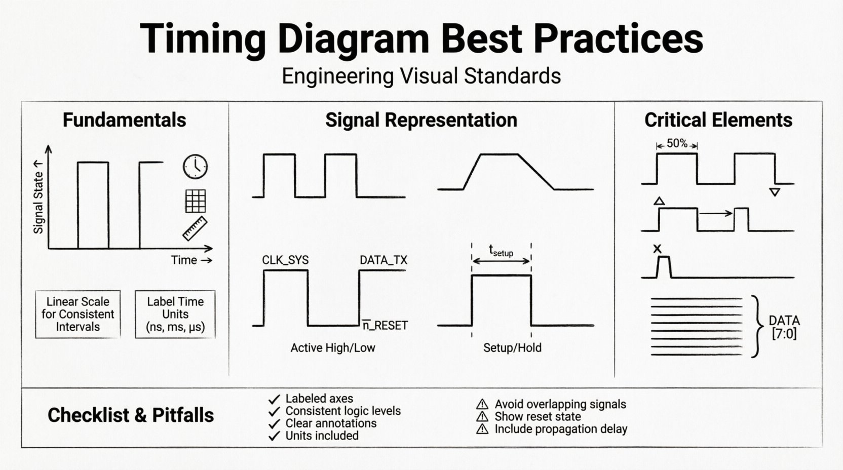
A timing diagram is a graphical representation of how signals change state over time. It is not merely a drawing; it is a specification. Whether you are working on hardware interfaces, embedded systems, or software protocols, the underlying principle remains the same: time flows horizontally, and signal states are plotted vertically. Clarity in this context is not a luxury; it is a requirement for safety and reliability.
When creating these visuals, the goal is to reduce cognitive load for the reader. They should not have to guess where the clock starts, which line represents the data, or what the voltage thresholds are. Every element must serve a purpose.
- Time Axis: The horizontal dimension represents the progression of time. It can be linear or logarithmic depending on the events being captured.
- Signal Lines: The vertical dimension represents the state of a signal, such as High/Low, 1/0, or voltage levels.
- Events: Specific points in time where changes occur, such as edges, pulses, or data transfers.
📏 Setting Up Your Canvas and Scale
The foundation of a clear diagram is the grid. Without a consistent scale, the relationship between events becomes distorted. A sketch that looks correct at one zoom level may reveal critical timing violations at another.
1. Defining the Time Scale
Time scales should be chosen based on the fastest event in the system. If you are documenting a microsecond-level interaction, drawing the timeline in milliseconds will obscure the details. Conversely, if the events span seconds, a microsecond scale creates unnecessary noise. Always label the time unit clearly on the axis.
- Linear Scaling: Use this for consistent intervals. It is the standard for most protocol documentation.
- Logarithmic Scaling: Rarely used, but necessary when events span orders of magnitude (e.g., startup delays vs. processing times).
2. Grid Lines and Reference Points
Grid lines help the eye track time intervals across the diagram. Heavy grid lines should mark major units (e.g., 10ms), while lighter lines mark minor units (e.g., 1ms). This visual hierarchy prevents the reader from losing their place.
Ensure that vertical grid lines align with significant events. If a clock edge falls exactly on a grid line, it provides a natural anchor for reading setup and hold times. Do not force events to fit the grid if they represent real-world measurements; instead, adjust the grid or use annotations to show the offset.
⚡ Representing Signals Accurately
The way a signal is drawn dictates how it is interpreted. A rising edge implies a transition from low to high, but the speed and shape of that transition can carry meaning regarding signal integrity.
1. Signal States and Levels
Clearly define what constitutes a logical state. In digital logic, this is typically 0 (Low) and 1 (High). In analog or mixed-signal contexts, voltage levels (e.g., 0V to 5V) are required. Use distinct line styles to differentiate between:
- Active High: The signal is true when the line is at the upper level.
- Active Low: The signal is true when the line is at the lower level (often denoted with a bar over the signal name).
2. Edge Representation
Edges are the most critical part of the diagram. They indicate the exact moment a state change occurs. Use sharp, solid lines for ideal transitions. If you need to represent physical slew rates or rise times, draw them as slanted lines rather than vertical spikes.
Avoid jagged lines unless you are specifically documenting noise or glitches. Clean lines suggest stability; jagged lines suggest interference. Be intentional about the shape you draw.
3. Signal Naming Conventions
A signal name is not just a label; it is a definition. Avoid generic names like Signal_A or Wire_1. Instead, use functional names that describe the purpose, such as CLOCK_SYS or DATA_TX.
- Prefixes: Use standard prefixes to denote signal type (e.g.,
Nfor negative logic,CLKfor clock). - Case: Use uppercase for constants and signals, mixed case for variables if applicable.
- Consistency: Ensure the name on the diagram matches the name in the code or datasheet exactly.
⏱️ Clocking and Synchronization
Clocks drive the timing of synchronous systems. Misrepresenting a clock can invalidate the entire diagram. The clock signal is often the first reference point a reader checks.
1. Duty Cycle and Period
Draw the clock signal with a consistent duty cycle unless the system specifically requires variable timing. If the duty cycle is not 50%, annotate the high and low durations. The period (the time for one complete cycle) should be clearly marked.
For variable frequency systems, do not assume a constant line length represents a constant time. Label each period individually if they differ significantly.
2. Edge Triggering
Indicate whether the system triggers on the rising edge (positive) or falling edge (negative). You can use arrows or small triangles at the point of the edge. This is crucial for understanding when data is sampled.
- Rising Edge: Mark with a small triangle pointing up.
- Falling Edge: Mark with a small triangle pointing down.
3. Jitter and Phase
In high-speed systems, jitter (variation in timing) is a known factor. If you are drawing a theoretical ideal, straight lines are fine. If you are documenting measured behavior, use a shaded region or multiple traces to show the variance. Phase relationships between multiple clocks should be explicitly stated.
🔄 Handling Data Transitions
Data signals are often more complex than clocks. They change based on the state of the system. Properly documenting these transitions requires attention to the relationship between the data and the clock.
1. Setup and Hold Times
These are critical constraints for reliable data capture. Setup time is the duration before the clock edge that data must be stable. Hold time is the duration after the clock edge that data must remain stable. Visualize these as windows relative to the clock edge.
Draw vertical dashed lines to indicate the setup and hold windows. Label the duration in time units (e.g., t_setup = 5ns). This visualizes the margin available for the system to function correctly.
2. Metastability
When signals cross clock domains, metastability can occur. This is a state where the signal is neither fully high nor low. Represent this with a dashed line or a specific shading in the timing window. Documenting this warns the reader that the signal might take longer than usual to resolve.
3. Glitches and Noise
Spurious pulses, known as glitches, can cause logic errors. If a glitch is a known issue, draw it as a narrow pulse that does not meet the minimum pulse width requirement of the receiving logic. Do not hide these artifacts; they are often the root cause of intermittent failures.
🏷️ Annotation and Labeling
Text on a diagram carries weight. Overcrowding the diagram with text makes it unreadable. Under-labeling makes it ambiguous. Find the balance through strategic placement.
1. Positioning Text
Place text near the relevant part of the signal but avoid overlapping with signal lines. Use leader lines (thin lines connecting text to the signal) if the signal is too busy to hold text directly above or below it.
2. Units and Symbols
Always include units. Time should be in seconds, milliseconds, or nanoseconds. Voltage should be in volts. Do not rely on the reader to guess. Use standard symbols for logical operations (e.g., ! for NOT, & for AND) if you are showing logic equations alongside timing.
3. Legibility
Font size matters. In a printed document or on a screen, the text must be readable without zooming. If the diagram is complex, consider splitting it into multiple views: a high-level overview and a detailed close-up of specific events.
🚫 Common Pitfalls to Avoid
Even experienced engineers make mistakes when drafting these visuals. Being aware of common errors can save hours of debugging.
- Ignoring Propagation Delay: Signals take time to travel through wires and logic gates. If a signal changes at point A and arrives at point B, draw the delay. A vertical line at point B implies instantaneous travel, which is physically impossible.
- Inconsistent Logic Levels: Ensure that the definition of High and Low does not change halfway through the diagram. This is confusing and dangerous.
- Overlapping Signals: If two signals must cross, ensure they are clearly distinguishable. Use different line thicknesses or colors if permitted by the output medium.
- Missing Reset States: Systems often start in a specific state. Show the initial state before the clock begins running. This prevents confusion about what the signals are doing at time zero.
🧠 Advanced Considerations
As systems become more complex, timing diagrams must evolve to handle multi-channel and asynchronous scenarios.
1. Multi-Channel Timing
When dealing with buses (like data buses), group related signals together. Use a bracket to indicate that the lines above represent a bus width (e.g., DATA[7:0]). Show the transition of the entire group to indicate a parallel transfer.
2. Asynchronous Handshaking
Not all systems use a global clock. Handshake protocols rely on request and acknowledge signals. Draw these clearly with arrows indicating the direction of the handshake. Show the wait states where the system pauses until the signal is received.
3. Power Management States
Modern systems enter low-power modes. Indicate these transitions on the timing diagram. A signal might go low to indicate sleep mode, but the clock might stop or slow down. Document the power state alongside the timing state.
✅ Review Checklist
Before finalizing a diagram, run through this checklist to ensure compliance with best practices.
| Check Item | Criteria |
|---|---|
| Time Axis | Is the scale linear and labeled with units? |
| Signal Names | Are all signals named functionally and consistently? |
| Clock Edges | Are rising/falling edges clearly marked? |
| Transitions | Are setup/hold times visible and labeled? |
| Delays | Are propagation delays included where relevant? |
| Annotations | Is text legible and free of overlap? |
| Units | Are all measurements accompanied by units (ns, V, etc.)? |
| Initial State | Is the reset or idle state shown at the start? |
| Clarity | Can a peer engineer interpret this without asking questions? |
📝 Final Thoughts on Documentation
The quality of a timing diagram reflects the quality of the engineering behind it. A clear diagram facilitates collaboration between hardware and software teams, reduces debugging time, and ensures that future maintainers understand the system’s behavior. It is a tool for truth, not just illustration.
Focus on precision over aesthetics. While a pretty diagram is nice, a correct diagram is essential. Take the time to verify measurements, label every constraint, and align your visual language with the technical specifications. By adhering to these practices, you ensure that the timing information is preserved accurately throughout the product lifecycle.
Remember, the diagram is a contract. It defines how the system behaves. When you draw a line, you are making a promise about the signal’s behavior. Keep that promise clear, accurate, and unambiguous.
Adopting these standards elevates the professionalism of your documentation. It signals to your team and stakeholders that you value reliability and clarity. In the complex world of system design, a good diagram is often the difference between a successful launch and a recurring issue.
🔧 Conclusion
Creating effective timing diagrams requires a disciplined approach to layout, labeling, and representation. By prioritizing clarity, consistency, and technical accuracy, engineers can produce visuals that serve as reliable references for development and maintenance. Follow the guidelines regarding signal representation, clocking, and annotation to ensure your documentation stands the test of time and complexity.