


In modern organizations, the disconnect between business objectives and technical execution often leads to delays, budget overruns, and features that miss the mark. A primary cause of this friction is the language barrier. Business stakeholders speak in terms of value, outcomes, and customer needs, while technical teams discuss architecture, data structures, and protocols. To resolve this, visual modeling is essential. Data Flow Diagrams (DFDs) serve as a universal translator, providing a clear, standardized view of how information moves through a system. By adopting this visual language, teams can align their understanding before writing a single line of code.
This guide explores how to utilize DFDs effectively to foster collaboration, ensure accuracy, and streamline the development lifecycle. We will cover the fundamental components, the different levels of abstraction, and best practices for creating diagrams that satisfy both stakeholders and engineers.
Understanding the Communication Gap 🗣️
When a business requirement is handed off to a development team, it often undergoes interpretation. A stakeholder might request a “user profile update feature,” but the technical team must determine how that data is validated, stored, and secured. Without a shared visual reference, assumptions creep in. One team might assume the data is stored in real-time, while the other plans for batch processing.
DFDs mitigate this risk by focusing strictly on the movement of data rather than the logic of control. This distinction is crucial because it allows business analysts to validate the flow of information without getting bogged down in implementation details. Meanwhile, developers can use the same diagram to identify integration points and database requirements.
- Business Perspective: Focuses on inputs, outputs, and value exchange.
- Technical Perspective: Focuses on storage, processing, and transmission.
- DFD Perspective: Focuses on the movement and transformation of data between the two.
By visualizing these flows, teams can identify missing data points, redundant processes, or bottlenecks early in the design phase. This proactive approach reduces the cost of changes later in the project lifecycle.
What is a Data Flow Diagram? 📝
A Data Flow Diagram is a graphical representation of the flow of data through an information system. Unlike flowcharts, which emphasize control logic and decision points, DFDs emphasize the data itself. They show where data originates, how it is processed, where it is stored, and where it ends up.
DFDs are hierarchical. You start with a high-level overview and break down complex processes into smaller, manageable sub-processes. This modularity allows teams to zoom in on specific areas without losing sight of the overall system architecture.
Core Benefits of Using DFDs
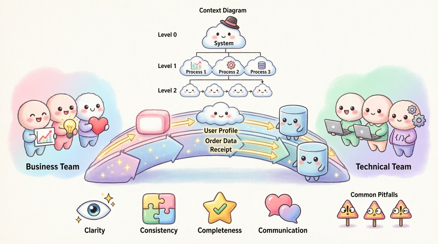
- Clarity: Visual representations are processed faster than text-heavy documentation.
- Consistency: Standard symbols ensure everyone interprets the diagram the same way.
- Completeness: Forces the team to account for every input and output.
- Communication: Acts as a common reference point during meetings and reviews.
Key Components and Symbols 🔑
To create a meaningful DFD, you must use standard notation. While there are slight variations between methodologies (such as Yourdon/DeMarco or Gane/Sarson), the core concepts remain consistent. Using these symbols ensures that the diagram is universally understood by analysts and engineers.
| Symbol Name | Visual Representation | Meaning | Example |
|---|---|---|---|
| External Entity | Rectangle or Square | Source or destination of data outside the system boundary. | Customer, Supplier, Payment Gateway |
| Process | Rounded Rectangle or Circle | A transformation that changes input data into output data. | Calculate Tax, Validate Login, Generate Report |
| Data Store | Open Rectangle or Parallel Lines | A place where data is stored for future use. | Database, File System, Log File |
| Data Flow | Arrow | The movement of data between entities, processes, and stores. | Order Details, Login Credentials, Receipt |
It is vital to label every arrow with a noun phrase describing the data, not a verb. For example, use “User Profile” instead of “Sending User Profile.” This keeps the focus on the information being transferred.
Levels of Abstraction in DFDs 📉
Complex systems cannot be described in a single view. To manage complexity, DFDs are created at different levels of detail. This hierarchical approach allows teams to start with a broad context and drill down into specifics.
1. Context Diagram (Level 0)
The Context Diagram is the highest-level view. It represents the entire system as a single process. It shows how the system interacts with external entities but does not show internal processes or data stores.
- Purpose: Define the system boundaries.
- Focus: High-level inputs and outputs.
- Audience: Executives and high-level stakeholders.
2. Level 1 Diagram
This diagram breaks the single process from the Context Diagram into major sub-processes. It introduces the primary data stores and the major flows between them.
- Purpose: Outline the main functional areas.
- Focus: Major data movement and storage.
- Audience: Business analysts and lead developers.
3. Level 2 and Below
Level 2 diagrams decompose specific processes from Level 1 into finer details. You continue this until the processes are atomic enough to be implemented directly.
- Purpose: Detailed specification for development.
- Focus: Specific logic and data validation.
- Audience: Software engineers and testers.
Step-by-Step Guide to Creating Effective DFDs 🛠️
Creating a robust diagram requires a structured approach. Rushing this process often leads to errors that require rework. Follow this sequence to ensure accuracy and alignment.
Step 1: Identify the Scope
Before drawing, define what is inside the system and what is outside. This establishes the boundary. Anything interacting with the system from the outside is an External Entity. Anything inside is a Process or Data Store.
- Ask: “Who provides data to the system?”
- Ask: “Who receives data from the system?”
- Ask: “Where is data saved?”
Step 2: Map External Entities
Place all external actors on the canvas. These are the touchpoints. Ensure you have a clear understanding of their role. For example, a “User” might be distinct from an “Administrator” depending on the data permissions required.
Step 3: Define Major Processes
Identify the core functions the system performs. Name each process with a verb and an object (e.g., “Process Payment”). Avoid vague names like “System” or “Do Stuff.” Each process must have at least one input and one output.
Step 4: Draw Data Flows
Connect the entities, processes, and stores with arrows. Ensure every arrow has a label. Check that data flows logically from one point to another. Do not skip steps in the chain of custody for the data.
Step 5: Validate with Stakeholders
Review the draft with both business and technical representatives. Ask the business side if the flow matches their expectations. Ask the technical side if the storage and processing points are feasible.
Step 6: Refine and Decompose
Once the high-level flow is agreed upon, begin breaking down complex processes. Create the next level of diagrams. Ensure that inputs and outputs match between the parent and child diagrams (conservation of data).
Common Pitfalls in Data Flow Modeling ⚠️
Even experienced modelers make mistakes. Being aware of common errors helps maintain the integrity of the diagram. The following issues often arise during the design phase.
1. The Black Hole
A process that has inputs but no outputs. This indicates a logic error where data is consumed but nothing is produced. In a real system, this would mean data is lost or an error is silently ignored.
2. The Miracle Process
A process that has outputs but no inputs. This suggests data is appearing out of nowhere. All data must have a source.
3. Unbalanced Flows
When decomposing a process, the inputs and outputs of the child diagram must match the parent. If a parent process sends “Order Data” to a child, the child cannot change that to “Invoice Data” without explanation. The data must be consistent across levels.
4. Control Flow vs. Data Flow
DFDs do not show control logic, such as “If X then Y.” They show data. Decision points should be represented by the flow of data changing, not by diamond shapes used in flowcharts. Keep the focus on information movement.
5. Overcomplication
Adding too many details to a high-level diagram confuses the reader. Save specific validation rules and error handling for lower-level diagrams or separate documentation.
Best Practices for Collaboration 🤝
The diagram is only as good as the conversation surrounding it. Use the DFD as a tool for discussion, not just documentation.
- Workshops: Conduct live modeling sessions where both teams contribute in real-time. This builds shared ownership.
- Version Control: Treat the diagrams like code. Store them in a repository and track changes over time.
- Naming Conventions: Agree on a standard for naming entities and processes. Consistency prevents confusion.
- Tooling: Use generic modeling tools that support export and import. Avoid formats that lock you into a specific vendor ecosystem.
- Regular Reviews: Update diagrams when requirements change. A stale diagram is worse than no diagram.
Integrating DFDs into Agile and DevOps Workflows 🔄
Modern development methodologies emphasize speed and iteration. DFDs can still play a role here, provided they are kept lightweight and up-to-date.
1. Sprint Planning
During planning, reference the Level 1 diagram to ensure the selected user stories fit within the defined data boundaries. This prevents scope creep where a feature requires a backend change that wasn’t anticipated.
2. Definition of Done
Include diagram updates in the Definition of Done. If a feature is deployed, the relevant DFD should reflect the new data flow. This ensures documentation stays in sync with the live system.
3. Incident Response
When a production issue occurs, the DFD helps trace the path of the data. Engineers can quickly identify where the flow deviated from the expected path, speeding up root cause analysis.
Measuring Success 📈
How do you know if your DFD strategy is working? Look for these indicators of improved alignment and efficiency.
- Reduced Rework: Fewer changes requested after development has started.
- Faster Onboarding: New team members understand the system architecture faster.
- Clearer Requirements: Fewer ambiguous questions during the refinement phase.
- Improved Testing: Test cases cover data paths more comprehensively.
Technical Considerations for Implementation 🛡️
While DFDs are conceptual, they have direct implications for the technical stack. Understanding these implications helps engineers design better systems.
Database Design
Data stores in the diagram often map directly to tables or collections. The flow between processes indicates foreign key relationships or API calls.
Security Boundaries
Identify where sensitive data moves. Data flows crossing security zones (e.g., from internet to internal network) require encryption and authentication checks. Mark these flows clearly.
Performance
High-volume data flows may indicate a need for caching or asynchronous processing. If a process handles too many concurrent requests, the DFD can highlight the need for scaling.
Maintaining the Diagrams 🔄
A diagram created today may be obsolete tomorrow. Systems evolve. Requirements shift. To keep the value high, maintenance is key.
- Assign Ownership: Designate a specific role to maintain the diagrams. Do not leave it as a shared responsibility with no owner.
- Trigger Updates: Link diagram updates to specific change requests or feature tickets.
- Archive Versions: Keep old versions for historical reference. This helps in understanding why a decision was made in the past.
- Automate Where Possible: If your tooling supports it, generate diagrams from code or configuration files to reduce manual drift.
The Human Element of Modeling 👥
Remember that diagrams are created by people and for people. The goal is not to produce a perfect technical artifact, but to facilitate understanding.
- Encourage Questions: Create an environment where junior team members feel comfortable asking about the flows.
- Visual Simplicity: If a diagram looks cluttered, simplify it. White space is your friend.
- Context Matters: A diagram for a CEO will differ from one for a database administrator. Tailor the level of detail to the audience.
By treating Data Flow Diagrams as a living communication tool rather than a static document, organizations can bridge the gap between business intent and technical reality. The effort invested in creating clear, accurate models pays dividends in reduced errors, faster delivery, and a more cohesive team culture.