


Designing complex software systems requires precise documentation. Visual models help stakeholders understand architecture before code is written. Among the Unified Modeling Language (UML) standards, two diagrams stand out for describing behavior over time: the Timing Diagram and the Sequence Diagram. While they share common origins, their focus diverges significantly.
Choosing the right model depends on whether you need to track message order or measure precise duration and state changes. This guide provides a technical breakdown of both diagram types, their components, and when to apply each within the software development lifecycle. 🛠️
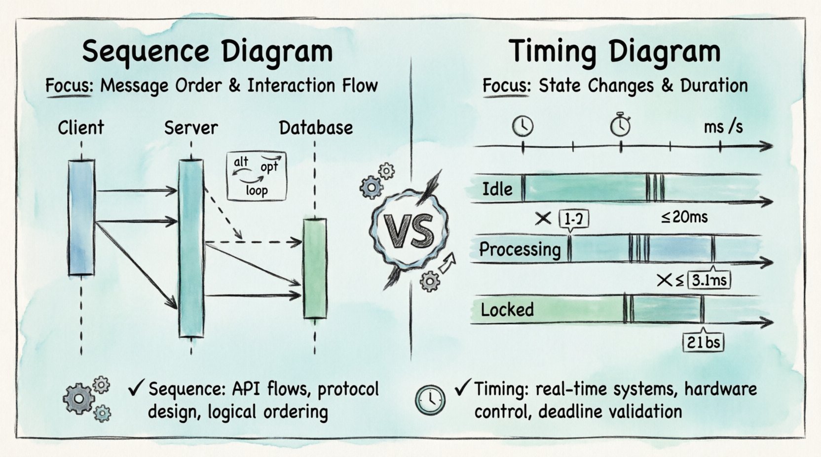
🔍 Understanding Sequence Diagrams
The Sequence Diagram is the workhorse of interaction modeling. It emphasizes the order of events between objects or components. Time flows downwards, and the horizontal axis represents different participants in the system.
Core Components
- Lifelines: Vertical dashed lines representing an object or actor. Each lifeline maintains a unique identity throughout the interaction.
- Messages: Arrows connecting lifelines. They indicate communication. Solid arrows denote synchronous calls, while dashed arrows indicate asynchronous signals or return values.
- Activation Bars: Rectangles on the lifeline showing when an object is actively performing an operation. This helps visualize thread blocking or processing time.
- Combined Fragments: Boxes labeled with keywords like
alt(alternative),opt(optional), orloop(iteration). These define logic flow without cluttering the diagram.
Primary Use Case: Interaction Flow
Use this diagram when the primary concern is who talks to whom and in what order. It is ideal for API documentation, use case flows, and protocol definitions. It answers questions like: Does the client wait for the server response before proceeding?
However, standard Sequence Diagrams lack explicit time units. They show logical ordering, not necessarily physical time elapsed. A message sent might take 10 milliseconds or 10 seconds; the diagram does not distinguish unless annotated with comments. ⏳
🕒 Understanding Timing Diagrams
The Timing Diagram is more specialized. It focuses on the changes in state of objects over time. The horizontal axis represents time, and the vertical axis represents objects or states. This diagram is critical for real-time systems where deadlines matter.
Core Components
- Time Axis: The horizontal line at the top. It marks time intervals (seconds, milliseconds, clock cycles).
- State Regions: Horizontal bands showing the state of an object (e.g.,
Idle,Processing,Locked). Transitions between states are marked by vertical lines. - Signal Events: Specific points in time where an event occurs, often triggering a state change.
- Constraints: Text notes defining maximum or minimum time limits for specific actions.
Primary Use Case: Time Constraints
This diagram is essential for embedded systems, hardware interfaces, and safety-critical software. It answers questions like: How long does the sensor take to stabilize before data is read? or Does the timeout handler trigger within 500ms?
Unlike the Sequence Diagram, the Timing Diagram does not focus on the message passing protocol itself, but rather the duration and state validity during the interaction. It visualizes concurrency more explicitly through overlapping state regions. 🔄
📊 Key Differences at a Glance
Understanding the distinction requires looking at the axes, the focus, and the output. The table below summarizes the technical differences.
| Feature | Sequence Diagram | Timing Diagram |
|---|---|---|
| Time Representation | Logical order (vertical axis) | Real-time scale (horizontal axis) |
| Primary Focus | Message passing and interaction | State changes and duration |
| Participants | Lifelines (Objects/Actors) | Lifelines (Objects/Signals) |
| Best For | Software protocols, API flows | Real-time systems, hardware control |
| Concurrency | Implied via parallel lifelines | Explicit via overlapping regions |
| Complexity | Medium (Logic heavy) | High (Time precision heavy) |
🛠️ Deep Dive: When to Choose Sequence
Sequence diagrams are the default choice for most application-level design. They map well to Object-Oriented Programming concepts. If your system relies on method calls, function invocations, or message queues, this is the model to use.
Scenario 1: API Integration
When designing a RESTful service, you need to document the request-response cycle. A sequence diagram shows the Client sending a GET request, the Server processing it, and returning a JSON payload. It captures authentication steps, error handling, and retries clearly.
- Benefit: Developers can see the exact order of dependencies.
- Benefit: Testers can derive test cases based on the message flow.
Scenario 2: User Interface Logic
In front-end development, sequence diagrams help map user clicks to backend actions. A button click triggers a validation check, which then triggers an API call. This visualizes the chain of events without needing to read the actual code logic.
Scenario 3: Asynchronous Messaging
Modern systems often use event-driven architectures (e.g., Kafka, RabbitMQ). Sequence diagrams handle asynchronous signals well. A sender pushes an event and continues immediately. The receiver processes it later. This distinction is crucial for understanding system responsiveness.
🛠️ Deep Dive: When to Choose Timing
Timing diagrams are more demanding to create but provide higher fidelity for time-sensitive systems. They bridge the gap between software logic and physical reality.
Scenario 1: Embedded Control Systems
Consider a motor control system. The software must read a sensor, calculate torque, and send a pulse to the motor within a specific window. A timing diagram shows the exact microsecond delays required. If the calculation takes too long, the motor might overshoot. The diagram highlights this risk.
- Benefit: Identifies bottlenecks in processing loops.
- Benefit: Validates hardware compatibility with software speed.
Scenario 2: State Machine Verification
Complex systems often use state machines (e.g., a traffic light controller). A timing diagram can show how long a state persists before transitioning. It ensures that the system does not get stuck in a state due to a missing event or timeout.
Scenario 3: Network Latency Analysis
When dealing with distributed systems across different geographic locations, latency varies. A timing diagram can illustrate the network propagation delay versus the processing time. This helps in tuning timeouts and retry strategies to prevent cascading failures.
🔄 Interplay Between the Two
These diagrams are not mutually exclusive. In a robust architecture documentation set, they often complement each other. The Sequence Diagram provides the “what” and “who”, while the Timing Diagram provides the “when” and “how long”.
Integration Strategy
- Start with Sequence: Define the logical flow. Ensure all components communicate correctly.
- Identify Time-Sensitive Points: Look for operations that require strict deadlines (e.g., timeouts, hardware interrupts).
- Drill Down with Timing: Create a Timing Diagram for the critical paths identified in the Sequence Diagram.
- Validate: Ensure the timing constraints do not violate the logical flow defined in the Sequence Diagram.
For example, a Sequence Diagram might show a login process. The Timing Diagram would specify that the session token must be generated within 200ms, or the user session expires.
⚠️ Common Pitfalls and Best Practices
Even experienced architects make mistakes when modeling. Avoid these common errors to maintain clarity and utility.
Pitfall 1: Mixing Time Scales
Do not mix logical time (sequence) with physical time (timing) on the same diagram unless necessary. It confuses the reader. If you need to show both, use separate diagrams for different levels of abstraction.
Pitfall 2: Overcomplicating Timing Diagrams
Timing Diagrams can become cluttered quickly. Avoid showing every single millisecond if it obscures the main behavior. Group time intervals or focus only on the critical transitions. Use abbreviations for long durations.
Pitfall 3: Ignoring Concurrency
Both diagrams struggle with high-concurrency scenarios. Sequence diagrams often imply sequential processing even when threads run in parallel. Timing diagrams are better at this, but you must explicitly draw overlapping regions to show parallel execution.
Best Practice 1: Consistent Naming
Ensure participant names in both diagrams match exactly. A component named “UserInterface” in the Sequence Diagram should not be “UI” in the Timing Diagram. Consistency aids cross-referencing.
Best Practice 2: Document Assumptions
Explicitly state the time units used in Timing Diagrams (ms, s, clock cycles). For Sequence Diagrams, clarify if the flow is synchronous or asynchronous by default in your project standards.
📝 Impact on the Development Lifecycle
These diagrams influence multiple stages of the Software Development Lifecycle (SDLC).
Requirement Analysis
During requirements gathering, Sequence Diagrams help clarify user stories. They translate text descriptions into visual flows. This reduces ambiguity before design begins.
System Design
Architects use Timing Diagrams to define performance requirements. If a system must respond in under 1 second, the timing diagram sets the boundary conditions for the infrastructure.
Testing
Test engineers use these models to write integration tests. A Sequence Diagram can be converted into a test script that verifies message order. A Timing Diagram can be used to verify that response times meet the SLA (Service Level Agreement).
Maintenance
When refactoring code, developers refer back to these diagrams to ensure they haven’t broken the interaction logic or the performance constraints. They serve as a source of truth for the intended behavior.
🎯 Conclusion
Selecting between a Timing Diagram and a Sequence Diagram depends on the specific problem you are solving. If your challenge is about interaction logic, message flow, and protocol, the Sequence Diagram is the appropriate tool. If your challenge involves deadlines, state duration, and real-time constraints, the Timing Diagram is required.
By understanding the strengths and limitations of each, you can create documentation that is both accurate and actionable. Combining them strategically provides a complete view of your system’s behavior, ensuring reliability and performance from design to deployment. 🚀
📚 Frequently Asked Questions
Can I use a Timing Diagram for software-only systems?
Yes, but only if time is a critical factor. For standard CRUD applications, the overhead of defining precise time units often outweighs the benefit. Use them for high-frequency trading, gaming loops, or real-time data processing.
Do these diagrams replace code?
No. They are abstractions. Code implementation must align with the diagrams, but diagrams do not capture every edge case or error handling detail found in production code.
Which tool should I use?
The choice of tool is secondary to the model itself. Ensure the tool supports UML standards and allows for clear export of these diagrams for team collaboration.