


Understanding how information moves through a system is critical for success. Whether you are defining requirements for a new platform or auditing an existing workflow, visualizing data movement helps everyone stay on the same page. A Data Flow Diagram (DFD) is a powerful tool designed for exactly this purpose. It maps out how data enters a system, how it changes, and where it ends up. For non-technical stakeholders, learning to read and interpret these diagrams removes the mystery from software development and business process analysis.
This guide breaks down the essential components, symbols, and logic behind Data Flow Diagrams. We will explore the standard notations used globally, the different levels of detail available, and how to spot common errors. By the end of this document, you will have the confidence to review diagrams, ask the right questions, and ensure your business processes are accurately represented.
🧩 What Is a Data Flow Diagram?
A Data Flow Diagram is a graphical representation of the flow of data through an information system. Unlike a flowchart, which shows the control flow or sequence of decisions, a DFD focuses strictly on the movement of data. It does not concern itself with time, loops, or conditional logic in the traditional programming sense. Instead, it answers three fundamental questions:
- Where does the data come from? (External Sources)
- What happens to the data? (Processes)
- Where does the data go? (Destinations or Storage)
Think of a DFD as a map for data. Just as a road map shows highways and exits without showing every tree or building, a DFD shows the major pathways of information without getting bogged down in code details. This abstraction is why it is so effective for business stakeholders who need to understand the “what” and “where” of information, rather than the “how” of the technical implementation.
🛑 The Four Core Symbols of DFD Notation
Regardless of the specific notation style you encounter, all DFDs rely on four fundamental shapes or concepts. Understanding these building blocks is the key to unlocking the meaning of any diagram you see.
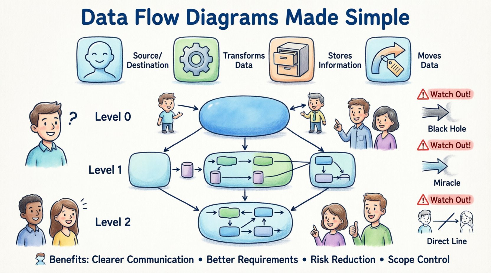
1. External Entity (The Source or Destination) 👤
An External Entity represents a person, organization, or system that exists outside the boundary of the system you are modeling. It is the starting point or the final recipient of data. In the diagram, these are often depicted as rectangles or squares.
- Example: A customer placing an order.
- Example: A payroll system receiving salary data.
- Example: A regulatory body requiring a report.
It is important to note that the diagram does not show what the entity does internally. It only shows the interaction with the system. If data comes from a user, the user is the entity. If data comes from a bank API, the bank is the entity.
2. Process (The Action) ⚙️
A Process represents an action that transforms input data into output data. This is where the “work” happens. In a DFD, processes are usually drawn as rounded rectangles or circles, depending on the notation style. Every process must have at least one input and one output.
- Example: Calculating the total price of an order.
- Example: Validating a login credential.
- Example: Generating an invoice PDF.
Processes are named using verbs followed by nouns (e.g., “Calculate Tax” rather than just “Tax”). This ensures the action is clear. A process cannot simply exist; it must change the data in some way.
3. Data Store (The Memory) 🗃️
A Data Store represents where information is saved for later retrieval. It is not a physical database on a server, but a logical representation of storage. In diagrams, these look like open-ended rectangles or parallel lines.
- Example: A file containing customer records.
- Example: A database table holding inventory levels.
- Example: A temporary log file for error tracking.
Data stores are passive. They do not change data on their own; they wait for a process to write to them or read from them. It is crucial to distinguish between a data store (permanent or semi-permanent) and a data flow (movement).
4. Data Flow (The Movement) 🔄
A Data Flow shows the movement of data between entities, processes, and stores. These are represented by arrows. The arrow indicates the direction of the data. The label on the arrow describes exactly what data is moving.
- Example: An arrow labeled “Customer Order” moving from an Entity to a Process.
- Example: An arrow labeled “Updated Inventory” moving from a Process to a Data Store.
Data flows should be named clearly. Avoid vague labels like “Data” or “Info.” Instead, use specific terms like “Credit Card Details” or “Shipping Address.” This specificity prevents confusion during review meetings.
📐 Comparing Notation Styles
There are two primary styles of DFD notation used in the industry. While they represent the same concepts, the shapes differ. Knowing the difference helps you interpret documents created by different teams or vendors.
| Component | Yourdon & DeMarco Notation | Gane & Sarson Notation |
|---|---|---|
| Process | Rounded Rectangle | Rectangle with rounded corners |
| External Entity | Rectangle | Rectangle |
| Data Store | Open-ended Rectangle | Open-ended Rectangle |
| Data Flow | Curved Arrow | Straight Arrow |
Both styles are valid. The Gane & Sarson style is often preferred in modern enterprise environments because the rectangular shapes align well with standard UI designs. However, the Yourdon & DeMarco style is still widely used in legacy documentation. The logic remains identical regardless of the shape used.
🏗️ Levels of Detail in DFDs
A single diagram cannot show everything. To manage complexity, DFDs are created at different levels of abstraction. This hierarchy allows stakeholders to see the big picture first, then drill down into specifics as needed.
1. Context Diagram (Level 0) 🌍
The Context Diagram is the highest level of abstraction. It shows the entire system as a single process in the center, surrounded by external entities. There are no internal data stores or sub-processes shown here.
- Purpose: To define the boundaries of the system.
- Use Case: Used at the very beginning of a project to agree on what is inside the system and what is outside.
- Visual: One circle (the system) with arrows connecting to external rectangles.
For stakeholders, this diagram answers the question: “What does this system do for us?” It is the most high-level view you will get.
2. Level 1 Diagram (Functional Decomposition) 🔍
The Level 1 diagram expands the single process from the Context Diagram into major sub-processes. It reveals the main functional areas of the system. Data stores are introduced here to show where information is kept between these major functions.
- Purpose: To outline the major functional components.
- Use Case: Used to plan the architecture and assign work to different teams.
- Visual: Multiple processes connected by flows and stores.
At this stage, stakeholders can verify that all critical business functions are accounted for. If a major business requirement is missing a process in this diagram, it must be added.
3. Level 2 Diagram (Detailed Logic) 🔬
Level 2 diagrams take specific processes from Level 1 and break them down further. These are used for complex calculations or intricate workflows. They are rarely shown to non-technical stakeholders unless a specific function is being debugged.
- Purpose: To define detailed logic for specific modules.
- Use Case: Development team reference and detailed testing plans.
- Visual: Highly granular flows and decision points.
Stakeholders should focus primarily on Context and Level 1 diagrams. Level 2 diagrams are typically technical artifacts that provide depth but not necessarily business value for high-level review.
🚦 How to Read a DFD Effectively
Reading a DFD requires a systematic approach. Do not just look at the shapes; follow the path of the data. This ensures you understand the lifecycle of the information.
Step 1: Identify the Boundary
Look at the diagram and determine what is inside the system and what is outside. Everything inside is controlled by the system. Everything outside is an external influence. If you see a process outside the boundary that should be inside, it is a scope issue.
Step 2: Trace the Input
Find an External Entity. Follow the arrow entering the system. Ask yourself: “What data is required to start this process?” If the data is missing, the process cannot function. This helps identify missing requirements.
Step 3: Follow the Transformation
Move from one process to the next. Ask: “How did the data change?” If data flows from Process A to Process B, the output of A becomes the input of B. If the data types do not match, there is a design flaw.
Step 4: Check Storage
Locate the Data Stores. Ask: “Why is this data being saved?” Is it needed for future reporting? Is it needed to recall past transactions? If a process writes to a store but no other process reads from it, that storage is unnecessary and adds cost.
Step 5: Verify Outputs
Follow the arrows leaving the system. Do they reach the correct External Entities? If the system generates a report, is there a path for that report to reach the user? If the diagram ends in a dead end, the system is incomplete.
⚠️ Common DFD Mistakes and Anomalies
Even experienced modelers make mistakes. As a stakeholder, knowing these common errors allows you to catch them during review. Spotting these issues early saves significant time and money later in development.
1. Black Holes
A Black Hole occurs when a process has input data but no output data. The data enters, disappears, and nothing happens. In a real system, this is an error. If a user submits a form, the system must either save it, reject it, or send a confirmation. It cannot just vanish.
2. Miracles
A Miracle is the opposite of a Black Hole. It is a process that has output data but no input data. Where did the data come from? If the system generates a daily report, there must be an input trigger or a data source feeding that report. Data cannot be created from nothing.
3. Data Flow Directly Between Entity and Store
Data must always pass through a process to reach a Data Store. You cannot draw a line from a User directly to a Database. There must be a process (e.g., “Save Record”) that handles the transaction. This ensures validation and logic are applied before storage.
4. Unbalanced Flows
When you decompose a diagram from Level 0 to Level 1, the inputs and outputs must match. If the Context Diagram shows “Order” coming in, the Level 1 diagram must show “Order” coming in. If it disappears, the decomposition is unbalanced and inaccurate.
5. Circular Data Flows
Data should not flow in a circle without being processed. If Process A sends data to Process B, and Process B sends data back to Process A without a Data Store or external change in between, it creates an infinite loop. This indicates a logical error in the process flow.
🤝 Benefits for Non-Technical Stakeholders
Why should you care about learning this notation? The benefits extend beyond just understanding a diagram. It improves your role in the project significantly.
Better Requirement Gathering
When you understand DFDs, you can spot gaps in requirements. If a stakeholder says, “We need to track user login,” but the diagram shows no process for authentication, you can immediately flag this. You become a proactive validator rather than a passive observer.
Clearer Communication
Words can be ambiguous. “Save the data” might mean “save to a file” or “save to a database.” A DFD clarifies the destination visually. This reduces miscommunication between business teams and technical teams. Everyone looks at the same map and agrees on the destination.
Risk Reduction
Errors found in the design phase are cheap to fix. Errors found after coding are expensive. By reviewing the DFD before development begins, you catch logical flaws. This prevents the waste of resources building features that do not work as intended.
Scope Management
DFDs clearly define boundaries. They show what is inside the system and what is outside. This helps prevent “scope creep.” If a stakeholder requests a new feature that falls outside the defined entities and processes, the DFD provides visual evidence to manage that request.
🔧 Best Practices for Maintaining DFDs
A diagram is only useful if it is accurate. Over time, systems change, and diagrams can become outdated. Keeping them current is essential for long-term success.
- Version Control: Treat DFDs like code. Save versions when significant changes occur. This allows you to track how the system evolved over time.
- Review Cycles: Schedule regular reviews of the diagrams. Do not wait for a crisis to check them. A quarterly review ensures alignment with current business needs.
- Stakeholder Sign-off: Ensure key stakeholders sign off on the Level 1 diagram before coding begins. This formal agreement validates that the model matches business expectations.
- Clarity Over Completeness: Do not try to show every single field in a data store. Focus on the logical flow. Too much detail obscures the main purpose of the diagram.
- Consistent Naming: Use the same terms across all diagrams. If you call it “Customer” in one place and “Client” in another, it creates confusion. Maintain a glossary of terms.
📝 Conclusion
Data Flow Diagrams are more than just technical drawings; they are communication tools that bridge the gap between business goals and technical execution. By understanding the four core symbols, recognizing the different levels of detail, and knowing how to spot common errors, you gain a significant advantage in managing system projects.
You do not need to be a developer to derive value from these diagrams. You only need to understand the flow of information. This knowledge empowers you to ask better questions, challenge assumptions, and ensure that the final product truly serves the business needs. As systems become more complex, the need for clear, visual documentation becomes even more critical. Mastering the basics of DFD notation is a step toward clearer, more efficient project delivery.
Remember, the goal is not perfection in the drawing, but clarity in understanding. Use these diagrams to facilitate conversation, identify risks, and align your team on the vision of the system. With a solid grasp of DFD notation, you can navigate the complexities of system design with confidence and precision.